Background
While working for Handsome, a client (Splunk) approached us to develop a strategy for a mobile design system that would span across 13 enterprise applications. I was the lead product designer responsible for auditing the current mobile applications, developing a system of components
Teams worked with— Product, Development, Brand, Strategy, Research.
My Responsibilities— Ideation, UI, Prototype, Usability Testing, design specifications, engineer handoff.
Platforms— iOS, Android.
Timeline— 3 Months.
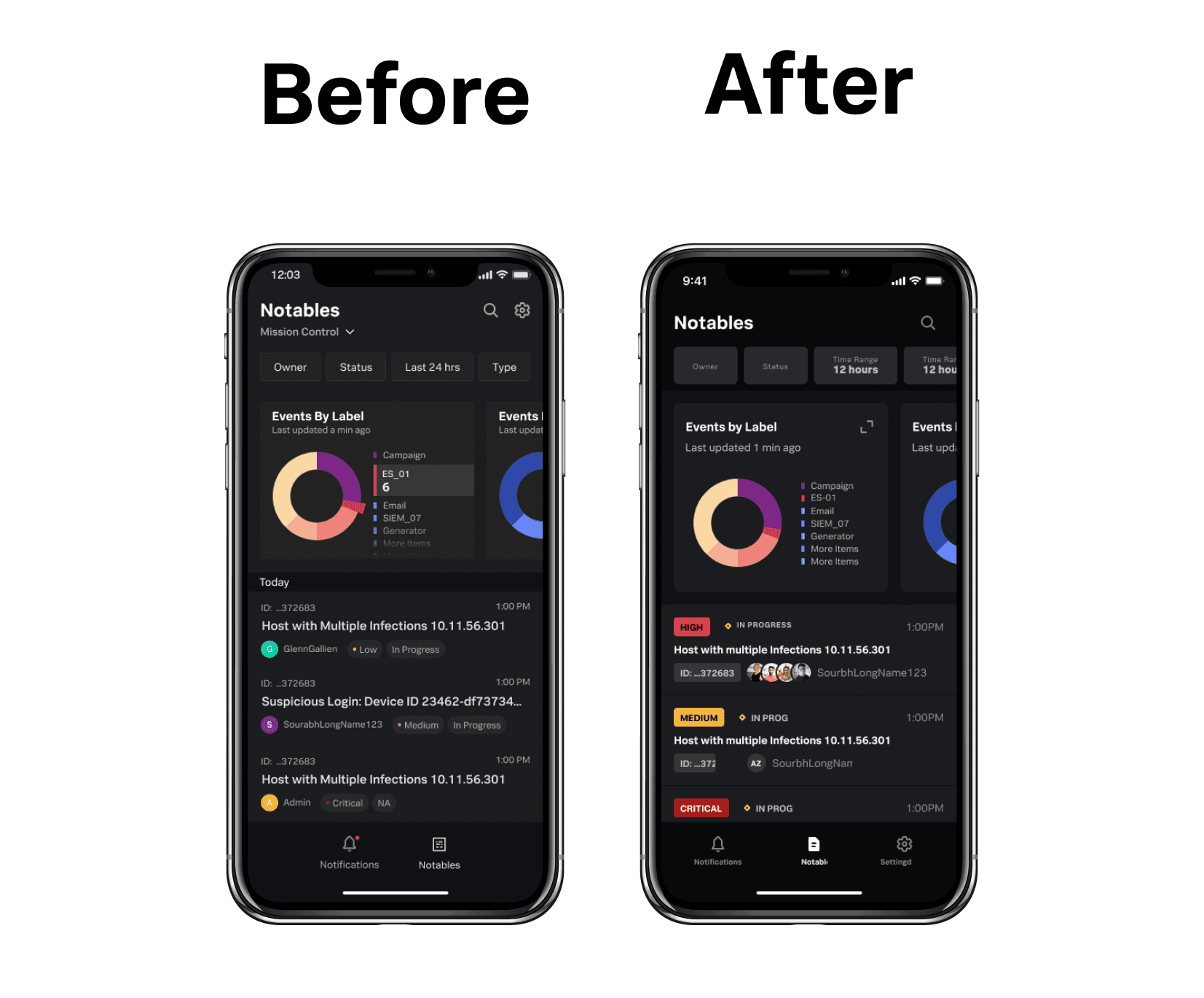
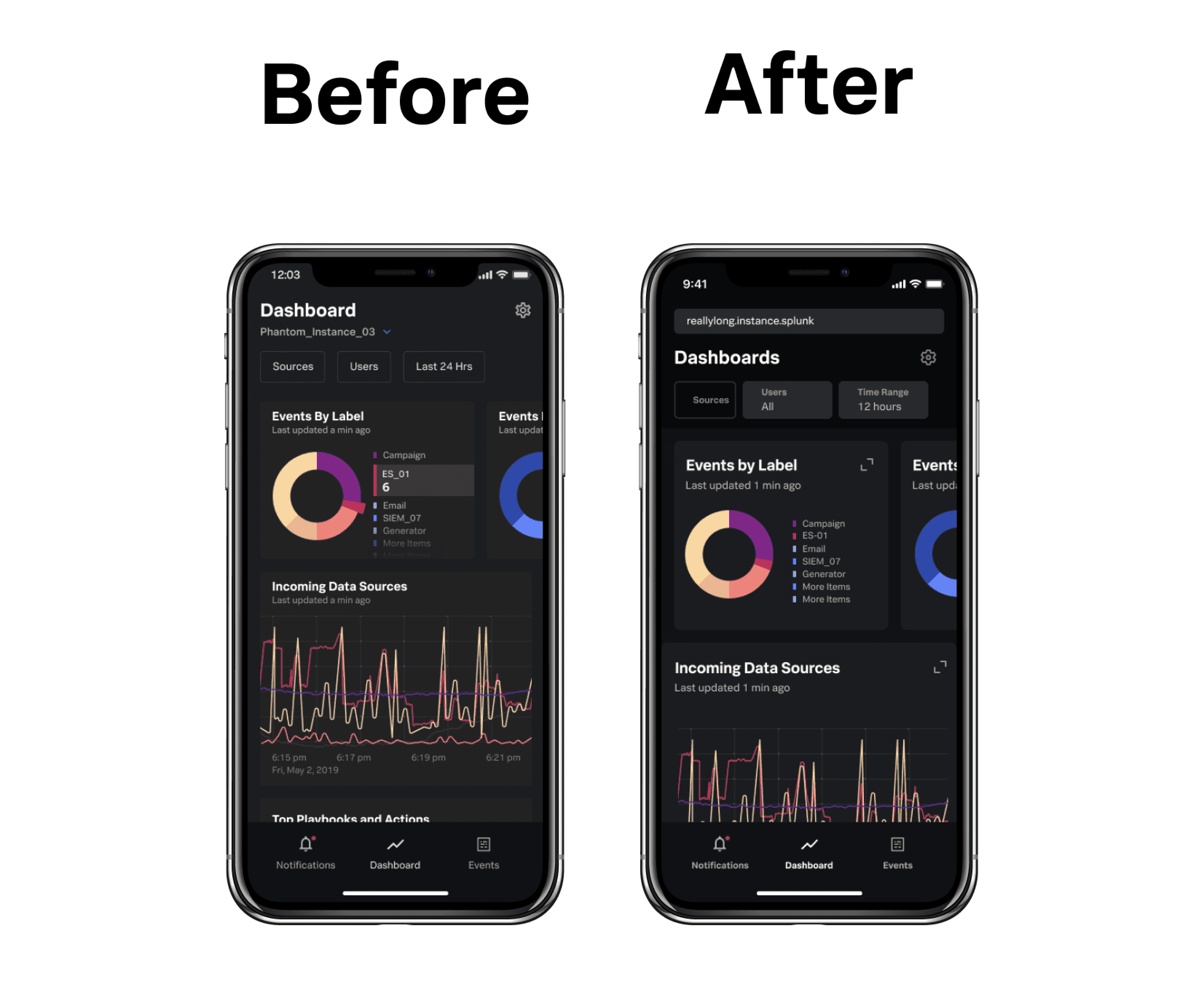
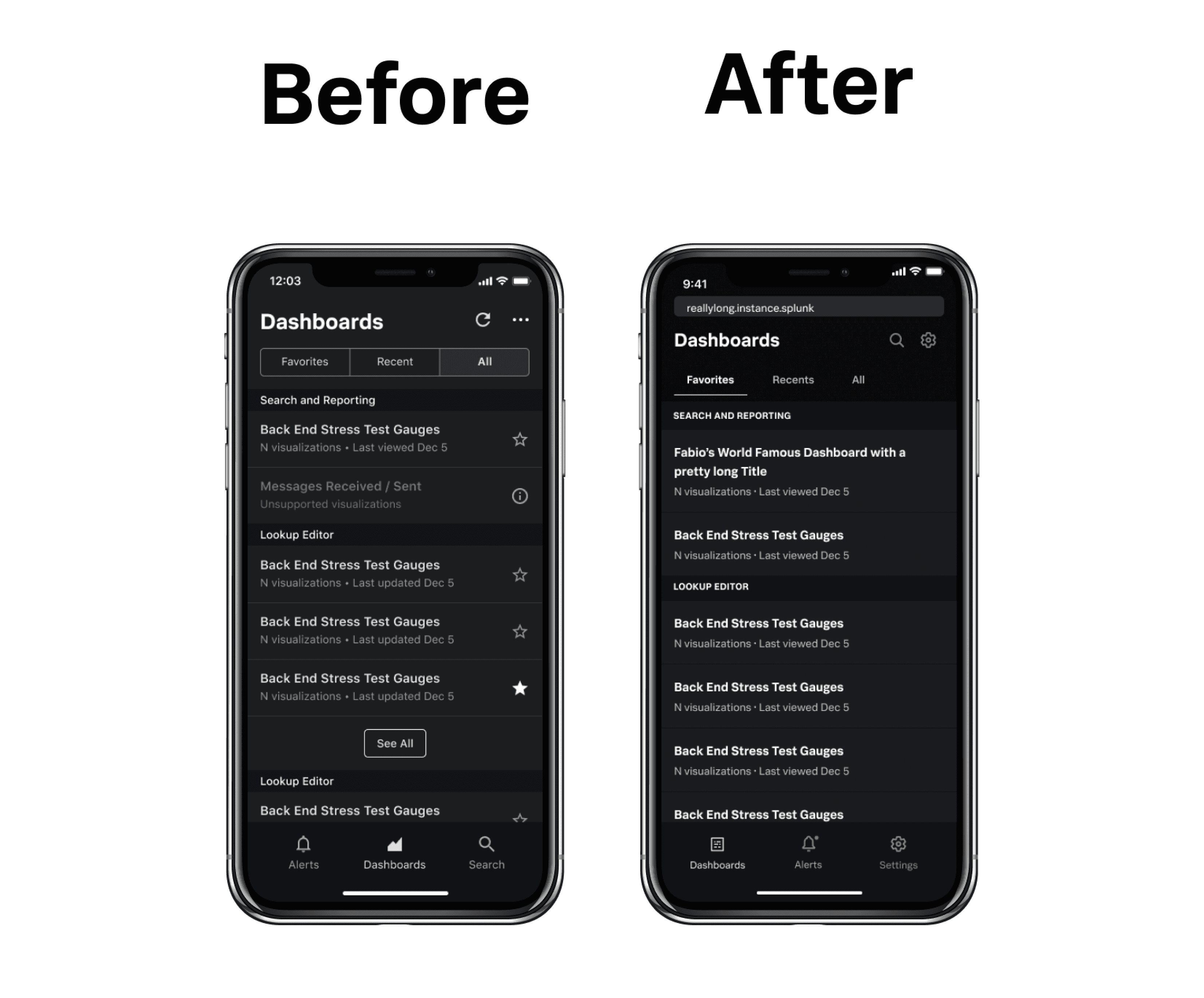
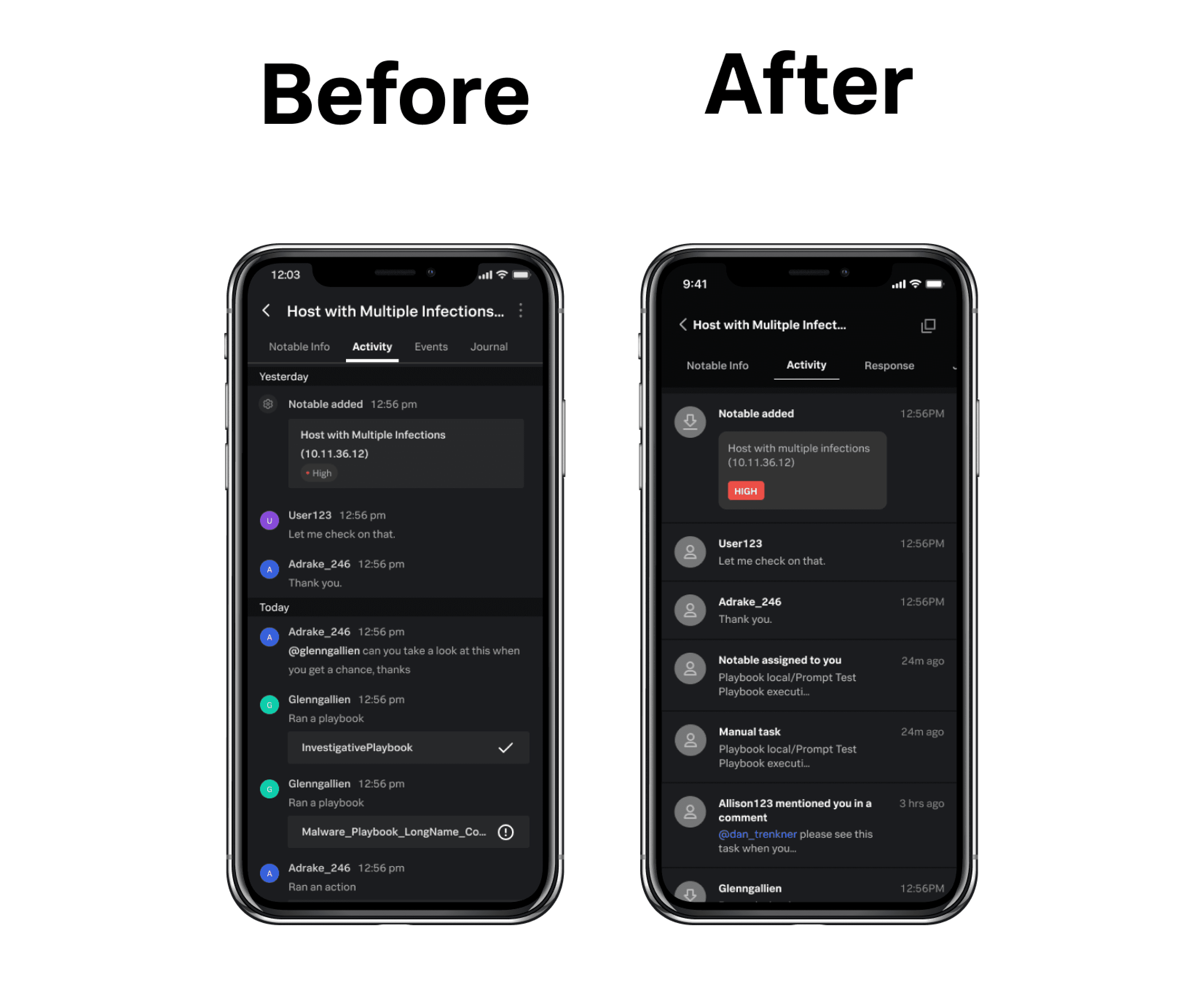
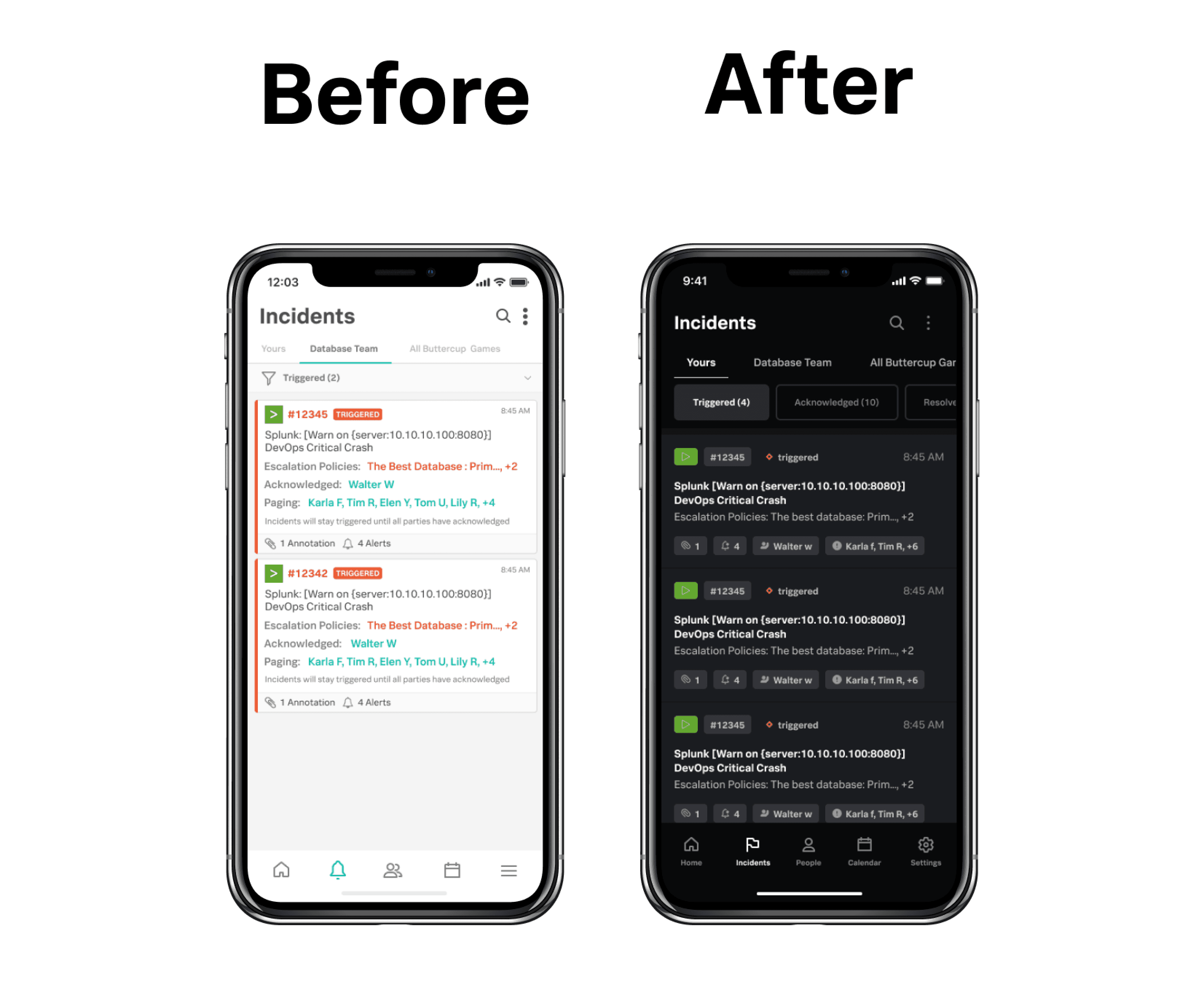
Current App Design Audit
I outlined a process of auditing the current mobile applications by breaking down each app and organizing by primitives (colors, font sizes, etc.), components, and pages. The first step was to do a high-level audit, identifying patterns and styles across all mobile applications in the company. Below is a snapshot of that process.
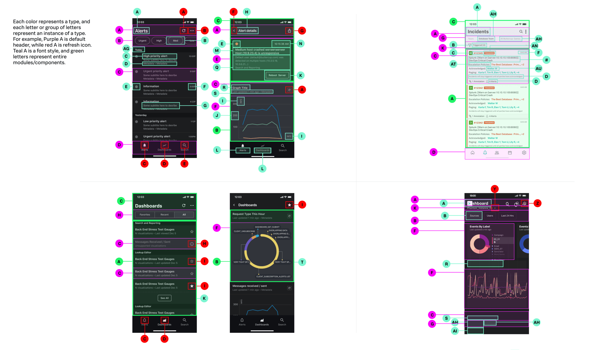
Next, I dove into the details to document the intricacies of each component that existed in multiple apps. The goal here was to identify components and elements that would be essential to all design teams in the ecosystem. Once we quickly identified those components, we could wireframe them up and use them as a MVP/prototype and test with internal design/development teams (the users for this project).
Building a Framework
Our next goal was to build out a framework that would be the blueprint for the new design system.
Below is a snapshot of the framework with detailed documentation showing foundational elements (typography, color, and grid system). We were conscious about accessibility, making a requirement for all elements (colors, fonts, etc.) to be WCAG 2.1 AA compliant.
Design system research
The next step was to research best-in-class design systems to better understand what parts of the Splunk design system we could reuse, and what elements we might need to improve. We reviewed IBM’s Carbon Design, Google’s Material Design, and Atlassians design system. We decided IBM’s Carbon design system was the best example to follow as the products, users, and problems aligned closely.
Testing the framework
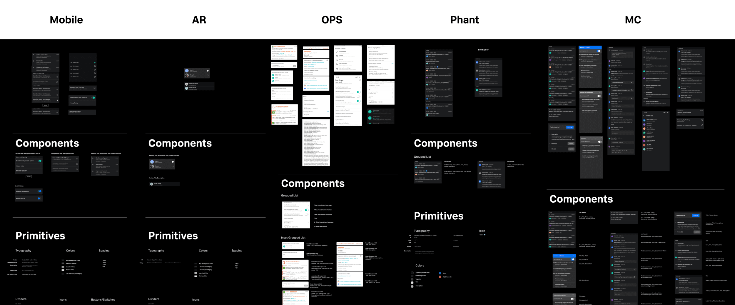
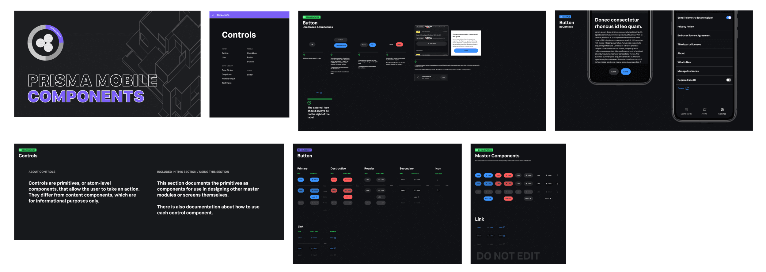
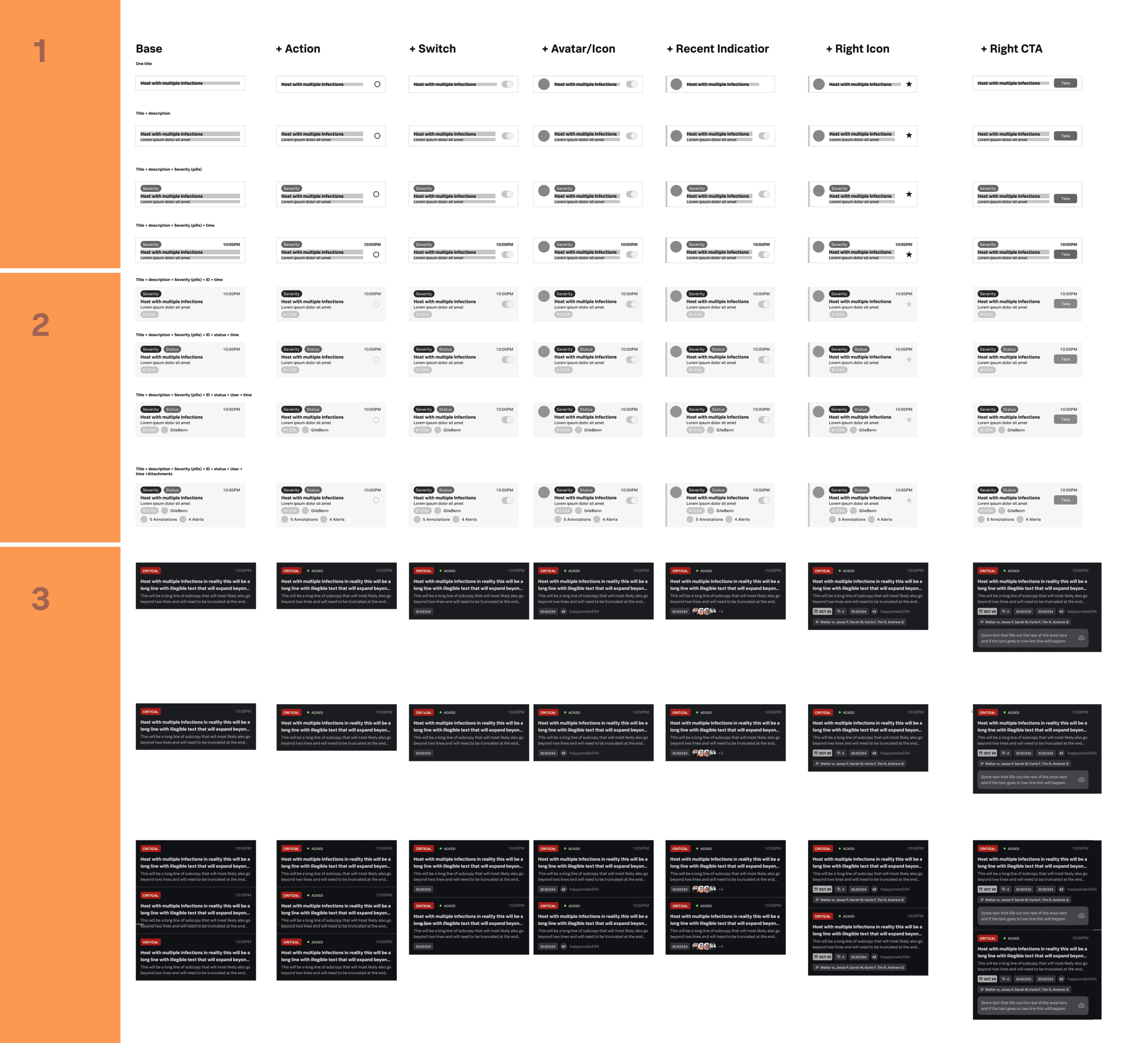
Next, my responsibility was to take the foundational elements and wireframe components that could be rapidly overlayed into current experiences. This was to make sure the system worked for all mobile applications and all design teams. Once we had an initial list of components, we worked with designers and developers across the organization to better understand their workflows and processes. Using this information, we were able to build out a two-tiered components system. One tier utilized auto-layout in Figma for designers to easily grab and place large components into working files, while the other system allowed the modules to be dissected and gave designers the flexibility to move, add, and edit primitives (base elements that make up modules, such as form fields, buttons, etc). Both were built, documented, and shared in Figma Libraries that could be used across teams. The image below provides a snapshot of each individual state of a component that was included in the documentation.
Working with developers
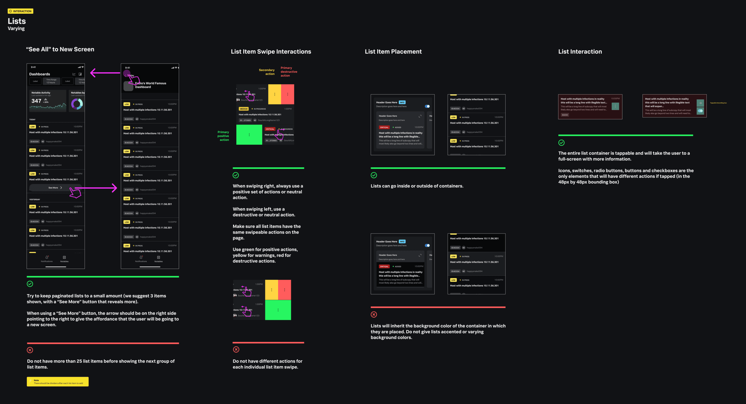
Once the components were documented for designers, we began to document the interactions for those components. Here is a snapshot of the final documentation that was provided for just one module system (lists). In the end, 12 modules were fully designed with over 120 pages of elements, documentation, and examples.
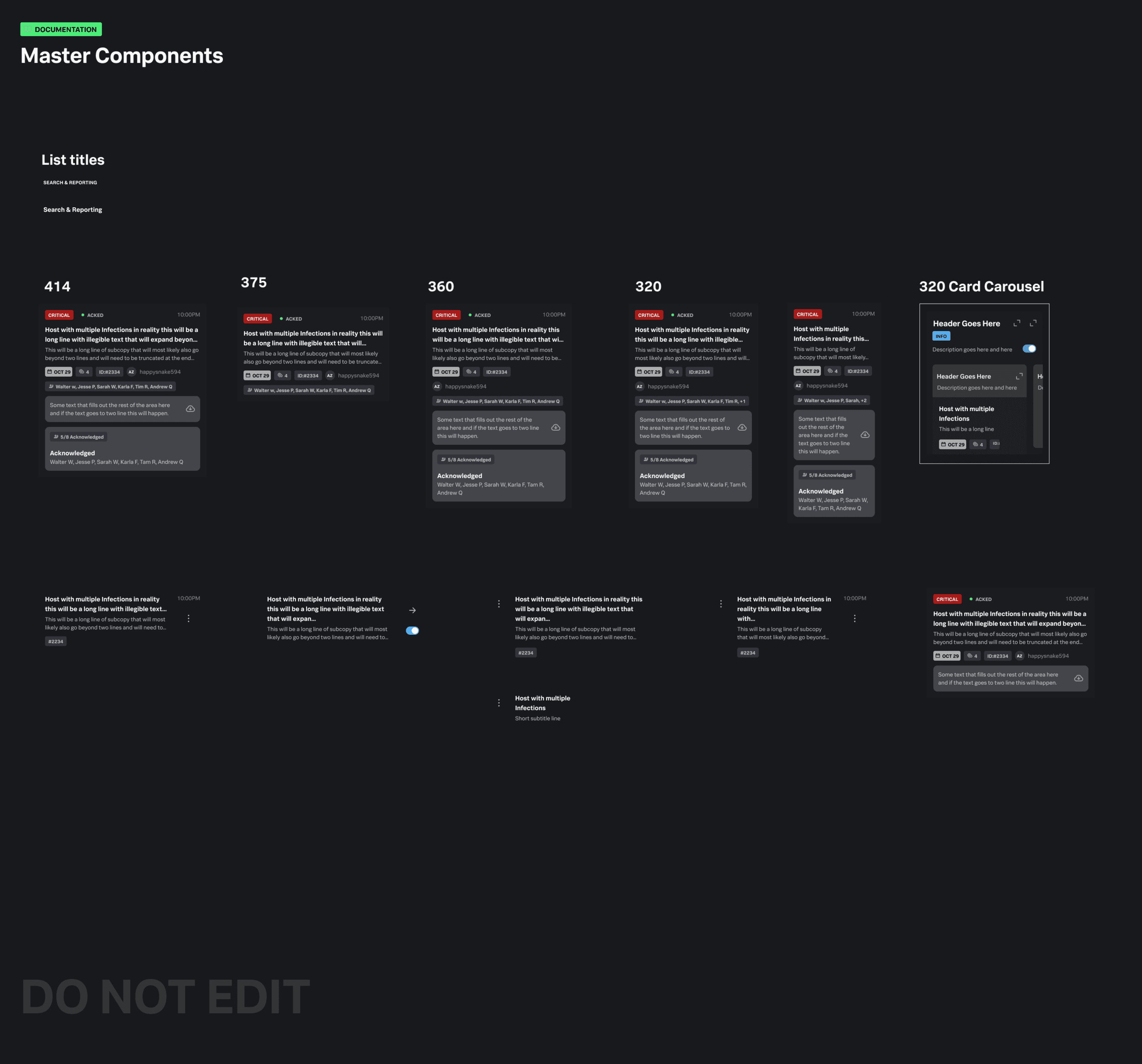
The image below highlights how components were built out to account for different device widths. The devices we focused on were the most common iOS and Android devices used by internal teams.
Results
100%
WCAG 2.1 AA compliance
12
design teams utilizing design system
120
pages of documentation, elements, and examples launched to internal teams