
Background
On the Jet mobile apps there are two main ways to find products. A user may perform a search across our entire catalogue using the search bar, or they can interact with the category navigation and browse for the product.
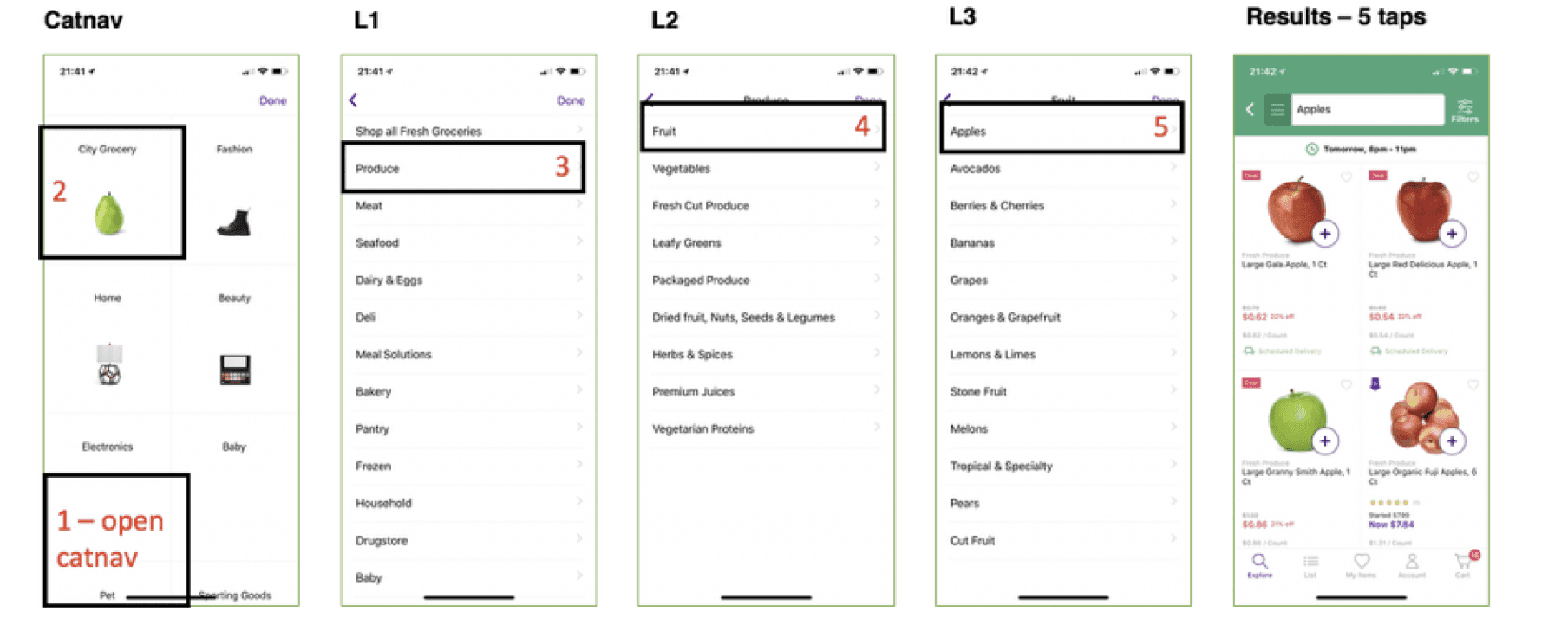
Our research and analytics team found that 42% of app users on iOS were engaging with the category navigation, but only 9% of those users were adding an item to their cart. A deeper look into our current app architecture revealed a flow that took roughly 5 taps to view products. This was creating a large bounce rate, which led to a drop in product engagement and average cart sizes on our mobile apps.
Problem
After diving deeper with users, we found that they were not sure if they were in the correct aisle when browsing for products.
How might we enable users to find items in the least amount of steps, while showcasing the breadth of our assortment?
Goal
Our goal was to help users find what they want quick & easily or discover things relevant to them. We want this to be scaleable and usable for the long-term, so we made a decision to create a navigation framework. This would ground cross-product teams and new decisions within this framework.
Constraints
The updates for the MVP needed to be within our current app architecture and design system. Keeping this in mind we decided to focus on launching an MVP that would quickly solve the bounce rate issues. Once this was achieved within the 3 week timeframe, we wanted to focus on restructuring the app’s navigation through testing and iteration.
Understanding our users
For this project, we focused on two main user types, the new user and the returning weekly household shopper. These users are subsets of our main target persona, the affluent metro New York customer. This user is typically living in a small apartment so they are space conscious. They are used to groceries being delivered fresh to their door. When using a service, they expect the online experience to be easy to use, easy to navigate, and less-expensive compared to shopping in-store.


New users
Affluent, price comparison shoppers who want to view our assortment as quickly as possible. This user expects a typical native navigation structure. These users are typically browsing to get a gauge on Jet’s prices and assortment. The user will then compare these products with other sites, like Walmart and Amazon.

Returning weekly household shopper
Our weekly household users trusts the Jet brand when it comes to low prices and good quality products. The returning household shopper is in the mindset of ordering his/her weekly essentials and getting back to life. They have little desire in new products, unless the recommendations are relevant.
Current user flow
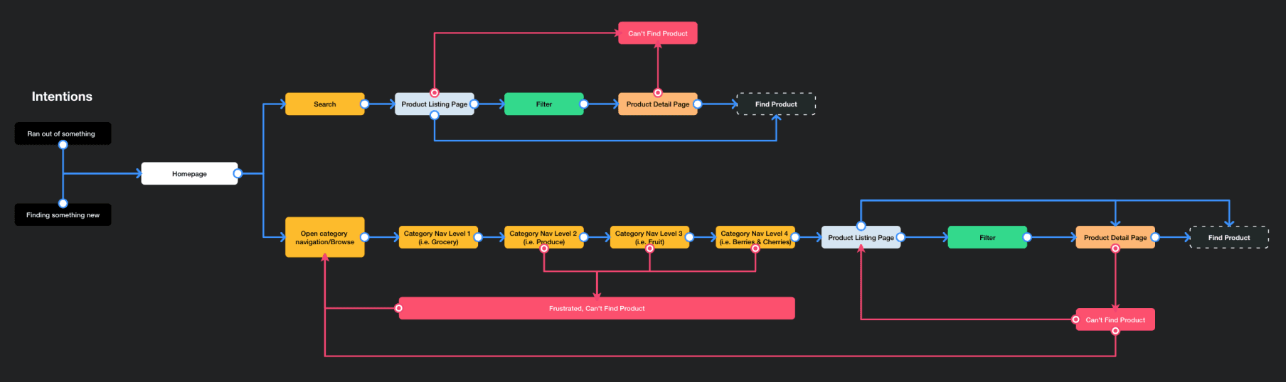
Pain points (Current experience)
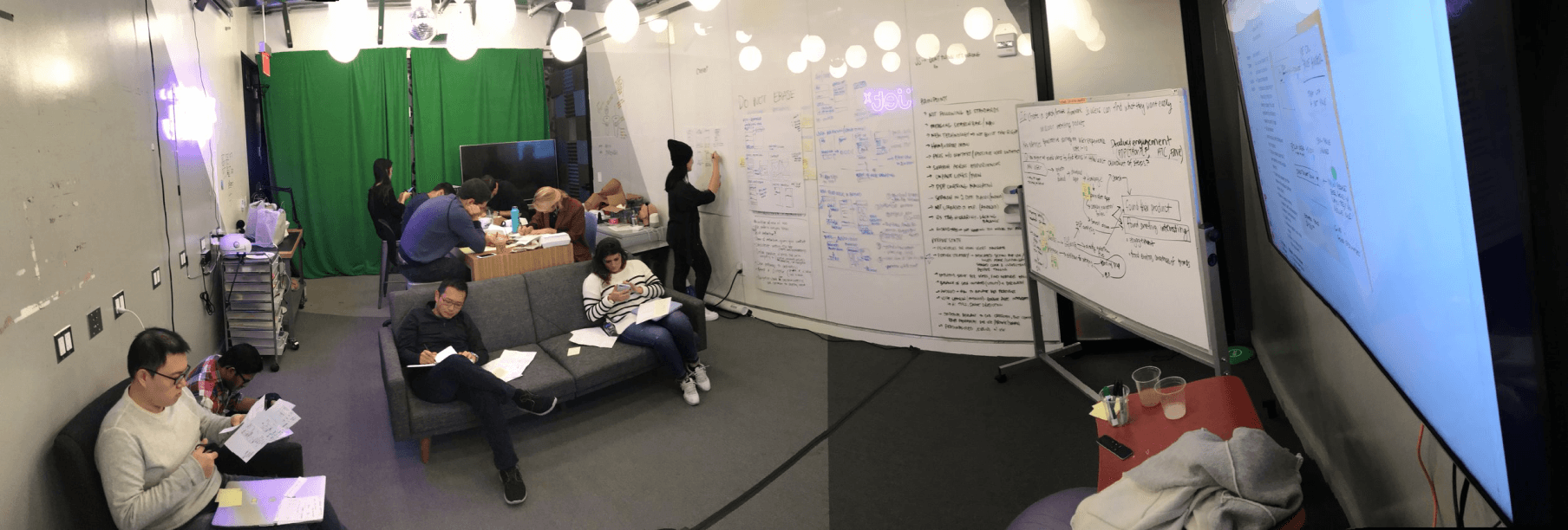
Design Sprint and Rapid Prototype Approach
After outlining the above, a design sprint was organized with the core team. We reviewed and aligned on the long term goal, current user flow and pain points. Then, we wrote out How Might We statements to focus on a direction for our prototype.

Competitive analysis
Before the design sprint, each member of the core team was tasked with finding a competitor that they thought was doing the browse experience well. We then went around the room and asked everyone to present their competitors. Every pattern was documented and given a specific list of pros and cons.
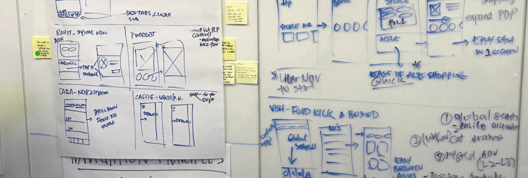
Brainstorming
Next, each member of the core team went into a heads-down mode to sketch out different ideas and navigation patterns that we could prototype. When the sketching session was over, everyone presented their ideas and then voted on the ones they liked the best.

Iterations
The idea that was agreed on was displaying every sub-category as a carousel of products, providing a clear glimpse into our assortment that is contained under that sub-category. After the team agreed on an idea and patterns to follow, we disbanded and I worked with the research team to outline a script and questions to ask during our rounds of testing. Once this was finalized, I put together a prototype and we got to testing.
Key Performance Indicators
Average number of dry and fresh items in a users cart from browse
Engagement with products post-category navigation
Add to cart rate from a product listing page
Time to add items to cart
Average cart size
Average order total
User testing rapid prototypes
Every week we have roughly 5 users come into the office to sit down with our prototypes. For these sessions they walked through a script, and answered questions that the user researcher and I provided. The user researcher was leading and facilitating the tests, and I was remotely watching and commenting during the sessions.
Prototype 1
The first hypothesis we explored was focused around showing items/products to the user as quickly as possible, while still giving them a simple way to navigate across departments.
Takeaways:
Users did not expect to be taken to the highest level of navigation when interacting with the category menu. As it turns out, users did not want to shop cross-category and instead wanted to focus on fresh and household goods. This was an interesting discovery, as some users mentioned not usually shopping for towels during the same trip that they would shop for grocery items.
Prototype 2
For this prototype, the decision was made to show products by Section, or roughly 3 taps to view products. A decision was also made to expose all Areas so a user can quickly jump between categories if they please. But we are not forcing them to do so.
Implementation
Phase 1
After figuring out the proper navigation structure, it was now time to implement this project with final designs. Sticking to the least amount of development effort and remaining in our current jet design system, the final production ready designs felt consistent with the rest of the app but improved on the prior navigation structure.
Outcomes
Add to cart rate increased from 9% to 21%
Average cart size increased from 5.3 to 7.01 (total native)
Fresh items in cart from 2 to 9
Average cart total increased from $63 to $72 (total native)
Average time spent adding items to cart decreased by 4%
Phase 2
After a few weeks of the new navigation being in the wild, we all gathered again to review the learnings. From there, we went through another quick design sprint to outline another ideal, improved flow. This time we included engineers from the beginning with the intention of using real data and implementing this in our current Jet app. This would allow us to consider advanced animations and flows, eliminating the limitation of an InVision prototype. Real data and native interactions, FTW!
New Goal: Make it easier to discover and browse our City Grocery Offering
Timeline: 2 Weeks (Sprints)
Here is the rough mock that I provided the engineer.

I sat with the engineer for a few days and we brainstormed animations, implementation details, and worked through edge cases. We then reviewed with the team and released it into the app behind a feature flag. We then put this app in front of real users and let them shop using the new experience. The feedback we got from users was astoundingly positive and confirmed the following hypothesis:
Users will be able to easily navigate "aisles" in the grocery category by utilizing the aisle hopper feature.
This will speed up add to cart rate and users visibility into our assortment.
Users will be able to easily discover the browse path if it is located on the bottom tab bar.
Users will be able to focus on their browse task if we minimize the search bar and hide it behind a search icon.
Phase 3
Expanding on the findings from the previous phase, the team wanted to focus on highlighting our Same/Next Day delivery service. This decision was made from our users giving us feedback on expecting that service as a standard when shopping fresh groceries. We decided to bring the filter for Same/Next day delivery eligible items to the front. Another decision was made for showing larger banner images in the initial navigation screen. During our earlier phase, we got a lot of positive feedback on the visual direction and the images showcasing products were helping users decide where to tap next.
This phase is currently undergoing user testing based on an interactive prototype that I designed and prototyped using InVision.

